Sega’s Rapidfire succession of new hardware releases sure did backfire on them. Released in North America only six months after the ill-fated 32X, ,the Saturn was the CD-based 32-bit console that Sega should have released all along instead of messing up the market with addons for the Genesis.
Sega had burned a lot of good will with their fans and with game developers by this point. It would have taken a truly great system with loads of classic games to get Sega back into everyone’s good books. As history can attest, the Saturn wasn’t this console.
To make things even worse for developers, all of the power that Sega kept on boasting of in press releases and commercials could only be unlocked by using both of the Saturn’s processors in tandem. That’s right the Saturn had two processors. This was long before the days of multi-core processors, and it’s still something different than a multi-core processor. Programming games for a two-processor console is extremely difficult. Most games that were released for the system didn’t even bother to try, and only used one of the Saturn’s processors.
That wasn’t the only problem. 3D polygon rendering was still fairly new at the time. Most other systems were using triangles to render their polygons, while the Saturn used quadrilaterals. This made things take that much longer to render and caused other complications, and it can be argued that this is another reason why the Saturn didn’t live up to its full potential.
The way that Sega launched the Saturn in the US was a bone-headed move as well. Sega had announced a release date of September 2 for the Saturn. Then at the very first E3 on May 11, they announced that the console would be available right then and there at four selected retailers.
This backfired on Sega in a big way. There were only six games available for the US market at launch. Other retailers were fucking pissed off that they had to scramble, and some even outright boycotted Sega over this debacle.
But the lack of developer and publisher support really hurt this system. Sega looked to all like it was floundering now, and industry newcomer Sony was off to a sprint with its console the PlayStation.
I own this system as real hardware, and I only have two golf games for it. I tried to get an emulator up and running on my PC so I could take some screenshots, but it was a no-go. So here is a review of the two games that I do have.
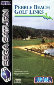
“Pebble Beach Golf Links”, 1995
This game starts off promisingly enough. I noticed right away that the painfully slow load times of the Sega CD were no more. There are still some waits for loading, but they’re not too long.
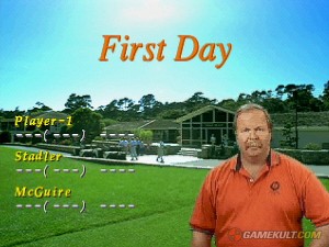
This game goes out of its way to visually impress. We’re in the 32-bit era now, so we can have things like full screen video that doesn’t look like shit.
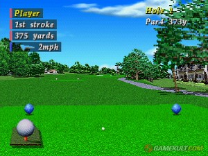
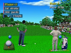
There is quite a bit of video in this game. Most of it is in the form of your golfer and caddy. There are video scenes of them rendered in front of the 3D view of the course as you play. This is supposed to add heightened realism to the game.
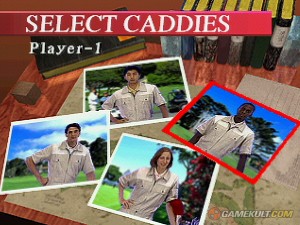
The interface to set up the options is consistent and easily navigable. While you’re in the menu, A & C are the action buttons and B cancels. Among the options you get to choose are ball view on/off, reverse view on/off, caddy on/off, and the ability to reassign the controller buttons. There are six gameplay modes and the ability to watch a demo. You can select one of four different golfers to play as, and one of four different caddies if you leave caddies on. Oddly, you can’t change your name from “Player-1” and “Player-2” to something else.
When you start to play, you get a course flyby and a detailed introduction to each hole, including tips on which clubs to use and what areas to avoid. Again, this is all fullscreen video, and it looks quite good. The sound is also excellent in quality as the video plays and there is no lag during this flyby and intro.
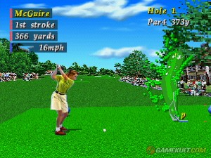
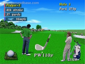
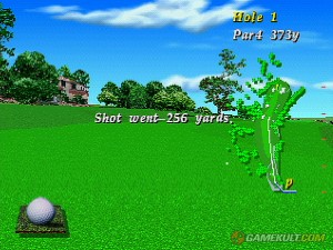
Once you get to the course view, you see most of the information you need onscreen. Pressing A will bring up an in-game menu, pressing B will cancel that or undo the last choice you made (including aiming and shot adjustments) and pressing C is the confirmation and action button.
Your golfer and caddy are fully animated, and there is constant soul-destroying smooth-jazz from hell playing. And you can not turn the music off. The animations and the music get annoying fast. You can skip the drawn-out, repetitive animations though.
The first thing you need to do is aim your shot. A big yellow and orange circle appears around you, and the direction pad will rotate the course view around you until you have aimed. When you press C, you can select your club. This brings up the longest and most annoying animation between you and your caddy while the atrocious soundtrack to golf damnation plays on. Pressing C again will bring up your stance graphic, and left and right on the direction pad will adjust this. You can also use the L and R shoulder buttons, but they adjust it way too much.
When you are ready to make your swing, press C again. This brings up a round power meter around your golfer. This power meter is 3-button-press type. And it actually took me a very long time to figure this out because this game is fucking broken garbage.
Sometimes the button presses don’t register, so at first I thought it was one of those where you hold the button and release it a the top. Nope. Only after making about 9 shots that went between 2 and 5 feet each did I just start madly mashing the C button and realize that it was indeed a 3-button meter. It’s just broken as fuck.
Now, I may be wrong about this, but isn’t the power meter a pretty fucking important part of a golf video game? Wouldn’t making sure it fucking works be a pretty important job for whatever company shat this turd out in 1995?
“Sorry, no time for testing or fixing bugs, we need to lengthen those adorable animation scenes between the golfer and the caddy!”
This is a very frustrating, very bad, very annoying game. The only reason I finished one hole at all is because I wanted to type something in this agitated state about the putting green.
WTF? I can’t turn the music off, but it stops abruptly when I get onto the green? Automatically, a terrain grid and a slope graph appear. The broken power meter turns into a broken 2-button power meter.
The End. And “Pebble Beach Golf Links” for the Sega Genesis was such a good game.
Okay, I have to wash my hands of this experience, return this game disc to the very back of the box where I’d kept it before and load up my other golf game.
“PGA Tour ’97”, 1996
I remember how the last PGA title I had played (“PGA Tour ’96”) had been a big drop in quality from a series that contains what I consider to be the absolute peak of the artform. I didn’t remember too much about this game, considering that I bought a batch of Saturn games off ebay specifically because it contained two golf games back in 2004.
It looks better than “Pebble Beach Golf Links” for the Saturn. The opening does contain some obnoxious rock guitar played over some “exciting” golf video in a montage that only made me roll my eyes.
The game menu switches from that hot, exciting rock music to some of that “hip hop” music that the kids are so crazy about these days. Seriously though, it’s just a repetitive drum loop with lame samples on top, so thank god this game allows you to turn the music off.
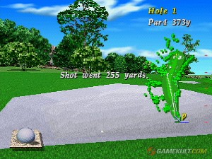
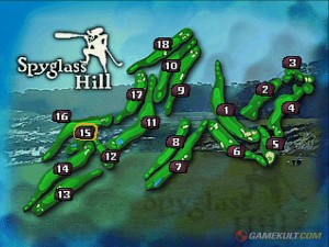
You get to choose among the now standard gameplay options, and the Spyglass Hill course is (I guess) rendered in detail. One thing I didn’t like about this game is that when I played a few holes in stroke play, the game didn’t auto-advance the hole. You can freely choose which hole to play in this mode, but I ended up playing the first hole twice before saying to myself “hey wait a minute… this looks awfully familiar…”
Other interfaces and info appear onscreen as you need them, but to me this just looks kind of dumbed-down. The whole game has a dumbed-down feel too, and I think this interface looks really bad and awfully dated too.
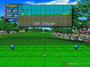
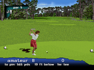
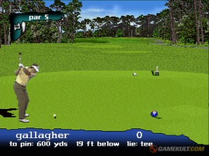
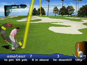
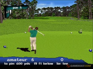
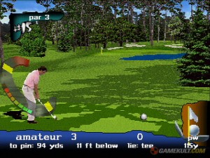
When you start the game, you get a standard view but it seems rather sparse to me. The controls are kind of standard and a lot like the other game I played for the Saturn. Start will bring up an ingame menu. Left and right on the direction pad will aim, for which you get this ridiculous massive yellow arc drawn across the screen from your ball’s position to the hole.
It’s like a rainbow of piss. The left and right shoulder buttons switch your clubs. Switching clubs will also alter the spacing of those yellow-marked zones visible on your circular power meter.
Also present in this game are background noises. Also fucked up by this game are background noises. They are way too loud, and when they blast out of the speakers, they only serve to distract. They can only be turned off and on, there is no volume control for them. This kind of thing has been handled so much better in other games, there is no excuse for flubbing it like this. There is also commentary that can be turned on or off, and it is very poorly done. How do you fuck up the voice acting on golf video game commentary? Play this game and find out.
Actually swinging and hitting the ball takes FOR-FUCKING-EVER. That is where this game falls down. It doesn’t just fall down, it trips over its own shoes that it has somehow tied together and goes tumbling down about ten flights of iron stairs.
The power meter is alright, but I personally don’t like the circular ones that appear over the golfer. It is 3-button press, and between the final button press and the start of the golfer animation, it affords you time to have a drink, go to the washroom, and run down to the corner store to buy a pack of smokes.
Okay, maybe I’m exaggerating a little. But a delay of longer than a second to load the animation data is just inexcusable. It completely wrecks any flow the game might have otherwise had and just ruins the game for me, whatever it’s good points might be.
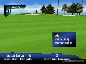
Also, this game has mulligans. I didn’t take these screenshots, so I’m guessing that they are only available on certain levels of difficulty and certain gameplay modes. I’ve made my opinion on mulligans known before. If you’re going to play a golf video game with mulligans, what’s the point?
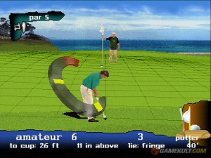
Getting onto the putting green doesn’t change a whole lot, except you see the grid appear automatically. The interface still looks like crap.
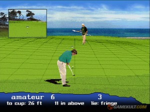
Oh, NOW you get a closeup of your ball. It would have been nice to have that long before the end of the hole.
So I judge this game to be even farther of a fall from grace from the heights of the old “PGA Tour Golf” series that I played on the Sega Genesis. This explains why I haven’t played it for my Sega Saturn since 2004. And I blame EA. They turn everything they touch in to shit these days, and it looks like they have been doing that for a very long time. But they’re not alone in being guilty of this. It’s all to common for large developers and publishers to want their games to only be massive hits and to only appeal to everybody all at once all the time forever.
It’s sad, but at least I’ve got “PGA European Tour” for the Sega Genesis to play any time I want. At least I’ve got “Chip Shot Super Pro Golf” for the Intellivision to play any time I want. I read something the other day that made me laugh, but it’s also very sad. This fucking horrible company EA released a golf game called “Tiger Woods PGA Tour 12”. They charged people money for it. But because EA is run, presumably, by people who don’t know right from wrong, they required everyone who bought this game to play it online on their servers. Now they have “discontinued” the game so they can use those servers for something else. That means that everyone who paid money for that game is now good and fucked and can never ever play that game again.
Why the fuck do people put up with this? Why the fuck hasn’t EA been taken out behind the shed and put out of its misery yet? I better not get started on this subject, this will turn into a very long and very angry rant.
Final word on “PGA Tour ’97”: Not a good game. This used to be a great series. EA ruined it.
