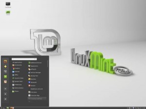
Well, I tried to give Linux Mint another try. This time I tried Linux Mint 13 with Cinnamon, 32 Bit. And I tried it on a computer that I’ve never tried to install Mint on before.
The live DVD wouldn’t even boot.
So as not to make the downloading and burning of that ISO a total waste, I decided to boot my laptop with it and check out Cinnamon.
Holy fucking graphical errors, Batman!
I didn’t take a screenshot, but here is a reconstruction I just made in MS Paint:
That’s pretty much all I saw. When I clicked on icons and the Mint menu, other empty rectangles would appear on different parts of the crashed-out blue background. How very minimalist. But it looks nothing like what I was expecting:
So I guess I’ll never know if Cinnamon is alright and usable for a guy like me. And I think this (sadly) kills off any experimentation I have with Mint as a Linux distro. So far I’ve only had success with Ubuntu, Xubuntu, Lubuntu and Puppy Linux. Let’s also fondly remember the late Fluxbuntu that breathed life back into my first PC years ago.
Why is this important? Ha! Trick question. This is far from important… but it sort of is to me. You see, Ubuntu is going in a direction that I don’t like. First with UI choices like Unity and now with adware like Amazon.com search results whenever you try to search for something on your computer. I don’t have to put up with any of that since I don’t use actual Ubuntu, but I’d rather just go to another distro altogether like Debian that still adheres to that Open Source ethos.
Okay, rant over.
Adios, Mint.

